 Half-man, half-vulture, Vultax hungers for heroes--dead or alive. He may be balding, but he sports wings and bad beak breath. Plus he works out.
Friday, February 27, 2009
Random Sketch 02: Scourge of the Skies!
Meet VULTAX the WINGED MANSLAYER!
 Half-man, half-vulture, Vultax hungers for heroes--dead or alive. He may be balding, but he sports wings and bad beak breath. Plus he works out.
Half-man, half-vulture, Vultax hungers for heroes--dead or alive. He may be balding, but he sports wings and bad beak breath. Plus he works out.
Thursday, February 26, 2009
Who is Erol Otus?
You mean you don't know? Erol Otus is one of the most unique and beloved fantasy artists from the early days of the genre! He's also my all-time favorite fantasy illustrator. He designed many product covers for TSR hobbies in the 70s and 80s and took things in a more psychedelic direction.
Some of Otus' work has graced the early Dungeons and Dragons basic books and game sets. Below is one my favorites.
 Click for a big, detailed looksee.
I love his artwork because it's colorful, it's expressive, and it's evocative. Much of the fantasy art that's prevalent today is almost photo-realistic, or trying to emulate a sustained, conventional approach. The result can be a muting of imagination. But not Otus--his stuff is wild and very personal. It's definitely his own persona showing through. In my mind, that's true art.
Otus' contemporary Jim Roslof did illustrations in a similar vein. Roslof is credited with creating the box top of my favorite board game, a fact I wasn't aware of until this year! Imagine going decades believing the art was Otus'!
 You can see many similarities between the two. Both employ an almost surreal effect in portraying monsters. The adventurers also have a lot in common, including the way they're drawn and in terms of color and adornments. But if you look closely, the artists don't use light the same way. Both pieces are quite colorful, but Otus' D&D cover is moodier. He won't let his light travel too far--just a few reflections off the dragon's snout (from the torch) and off the sorceress' arm (the green glowing ball). I'm still not entirely sure where the room light is coming from--which gives it an eerie, unsettling feeling. It's quite clear in the Roslof piece that the light is coming from three different sources--behind the monster (what the hell is that thing?!), the wizard's staff, and the treasure. Much brighter all around, and yet these two pieces seem to use similar color palettes.
I was surprised and delighted to learn of Roslof's work this year and now I count him among my favorites. Kind of a nice surprise--now there's another artist who's work I wasn't aware that I loved!
Anyway, when I saw the notice for the contest I thought this would be a great opportunity to practice my own decidedly pathetic art skills. While there are prizes, I really just wanted to be able to improve my drawing abilities (ha!) and have fun.
Learn more about Erol Otus and his work. Props to fellow Otus enthusiast and avid gamer Jeff Reints for his wonderful efforts to document Erol's work.
Contest Practice: Appetizer!
So I've been practicing with my EOC drawing pieces a little at a time. I spent some time on the wizard, now I'm working on the hapless victims.
 If you look at the concept I quickly sketched out this would be hapless victim number 1 (going from right to left). This character is prone and bleeding in the concept image. But I was really focusing on getting the pose down in this sketch. I had extra space and thought it would be good to give the victim something which to be afraid. So I added a happy little dragon.
The HTDTMW is helping with some good poses. I call this one "Appetizer" since, well, you get the idea...
Wednesday, February 25, 2009
No PhotoShop
Yeah, so my non-skills in drawing are dwarfed only by my non-skills in preparing images for the scanner. I don't have a current version of PhotoShop and if I did, I wouldn't know how to use it. So, what I do have is the crappy Microsoft image program that came with my computer and the scanner software.
What I've learned in the last few scans I've done is that my scanner is really light. To fix this, MS has thankfully added an 'auto-correct' button. Yup, I went there auto-correct. Now, I know what you're thinking, and you're right--it's totally bush league of me to use that button. If I cared at all about my sketches--my earnest and plucky works of art--I'd somehow acquire a decent program and learn how to use it.
But realistically, that just ain't going to happen. So, without further adieu, let me demonstrate the wonders of auto-correct:
BEFORE....


Digital bastardization is great for darkening lines. It's like night and day, right? Yeah, well, it's better than nothing. Bonus: feel free to click and enlarge those suckers to really get a sense of my "fine technical skills."
Learn to love it folks, because this is the pinnacle of image quality on this blog. Or it will, at least, until i learn to work better with the scanner. Just be glad I'm not taking photos with my phone!
What I've learned in the last few scans I've done is that my scanner is really light. To fix this, MS has thankfully added an 'auto-correct' button. Yup, I went there auto-correct. Now, I know what you're thinking, and you're right--it's totally bush league of me to use that button. If I cared at all about my sketches--my earnest and plucky works of art--I'd somehow acquire a decent program and learn how to use it.
But realistically, that just ain't going to happen. So, without further adieu, let me demonstrate the wonders of auto-correct:
BEFORE....

Faint pencil lines get lost. Not a lot of contrast. It's just all-around tough to see. Okay, now check out the...
AFTER....
AFTER....

Digital bastardization is great for darkening lines. It's like night and day, right? Yeah, well, it's better than nothing. Bonus: feel free to click and enlarge those suckers to really get a sense of my "fine technical skills."
Learn to love it folks, because this is the pinnacle of image quality on this blog. Or it will, at least, until i learn to work better with the scanner. Just be glad I'm not taking photos with my phone!
Random Sketch 01: Do it the MARVEL Way!
So, I've been practice sketching a few pieces of the Erol Otus Competition (EOC) piece along with just random doodles. I think the idea of the EOC has me freaked out a bit--so it's easier just to whip out a random sketch here or there that has no bearing on the piece, but still gives me a chance to practice. My skills aren't exactly progressing the way I would like, but I have enlisted help....
 Meet Mr. Stan Lee and Mr. John Buscema!
That's right, there's no easy road to perfection or greatness, but there are shortcuts to mediocrity and by Jove I've found one! "How To Draw Comics The Marvel Way" (Hereafter refered to by the ridiculous acronym HTDTMW) is actually a wonderful book if you're just learning to sketch and want to infuse your characters/human figures with dynamic poses. There's also a basic lesson on perspective that comes in handy. Now, I've read about a dozen or so sketch books in my time and they are all the same:
So I took a crack at one mimicing one of the generic figure poses. Here is Marvel's rough of a hero punching:

My exercise of same, taken to a fleshed out Bandai-like ninja character:

Apologies to Marvel Comics on the image use, but I want to illustrate how my lack of skill compared to their talented instruction.
The drawing is not great. So it's back to studying steps 1-4 again and practicing until I get it right! However, I would like to point out that I did take a few liberties, in the way of open hands, some costume elements, as well as a weapon/accessory. I even tried to make the ninja star look dynamic by making it bigger in the foreground as a way of adding perspective.
Meet Mr. Stan Lee and Mr. John Buscema!That's right, there's no easy road to perfection or greatness, but there are shortcuts to mediocrity and by Jove I've found one! "How To Draw Comics The Marvel Way" (Hereafter refered to by the ridiculous acronym HTDTMW) is actually a wonderful book if you're just learning to sketch and want to infuse your characters/human figures with dynamic poses. There's also a basic lesson on perspective that comes in handy. Now, I've read about a dozen or so sketch books in my time and they are all the same:
- Step 1: Basic shapes
- Step 2: Perspective
- Step 3: Human figures - loose sketches
- Step 4: Filling in the details
- Step 5: Steve Buscema's drawings look nothing like the crap you just took on that piece of paper. Please re-read steps 1-4 until you get it right!
So I took a crack at one mimicing one of the generic figure poses. Here is Marvel's rough of a hero punching:

My exercise of same, taken to a fleshed out Bandai-like ninja character:

Apologies to Marvel Comics on the image use, but I want to illustrate how my lack of skill compared to their talented instruction.
The drawing is not great. So it's back to studying steps 1-4 again and practicing until I get it right! However, I would like to point out that I did take a few liberties, in the way of open hands, some costume elements, as well as a weapon/accessory. I even tried to make the ninja star look dynamic by making it bigger in the foreground as a way of adding perspective.
Wednesday, February 11, 2009
Art Contest!
Okay, so I'm not an artist. I've always WANTED to draw, I've TRIED to draw, but my talent is--in a word--lacking. But I saw this Erol Otus fantasy illustration contest (more on E.O later) and I thought I'd give it a shot. The illustrations will be used in a sort of homegrown fantasy role playing game magazine called Fight On! and so they should reflect adventuring party situations that could happen during play. Entrants are given three themes by which to create their artwork:

Yeah, it's just AWFUL isn't it? That's because my drawing skills suck. As a matter of fact, one reason I began this blog was to document my shamefully poor skills--and hopefully--improve on them. See I have until May 2, 2009 to submit my illustration. So I figure I'll practice, work on ideas, and use the blog to track my progress. And you, poor reader, can suffer right along with me.
I created the concept sketch as soon as I saw the posting for the contest today (surfing at work, no less!). So let the record stand--today I had a terrible idea and put it down on paper--terribly!
Okay, so let me explain what's going on in the sketch. Those are two victims about to get squished by a giant's foot in some sort of adventure. That's a wizard in the foreground. No, that's not a baguette he's holding. It's a wand with...are you ready? One. LAST. Charge. Clever, huh?
No. It isn't. But I have some ideas on making it work. Anyway, I forgot to mention my disclaimer:
Let me just make it absolutely clear right now that I am not (obviously!) a professional or trained artist. I have zero ability. I'm as amateur as it gets. In fact, amateurs will hide their eyes in embarrassment (as you likely did) when viewing my "work."
I doodle a lot. but really, who doesn't? Nothing anyone could look at. And I break into a sweat anytime anyone looks at something I draw. Seriously, it's just mortifying!
When I got home this evening, I did a few additional sketches. This one is an attempt to flesh out some of the details in the concept:
 Yes, equally full of suck as the first one. Let's pray things improve, shall we? Hopefully you can see what I'm trying to do here--both in way of skill and in the actual composition. I selected the wizard as a character exercise. See, in the original concept the wizard is really torn between spending the last 'charge' contained in his wand on saving his friends, or in using it to get out of the dungeon with treasure he has in hand. His buddies are pretty much doomed in his eyes, but they are his buddies afterall....so...yeah...awkward....
Anyway, I think there are several elements key to the success of the wizard in this piece"
In any case, that hand holding the wand is wretched. I need to work on that.
- The Adventure Takes a Surprising Twist
- One Charge Left
- Overland

Yeah, it's just AWFUL isn't it? That's because my drawing skills suck. As a matter of fact, one reason I began this blog was to document my shamefully poor skills--and hopefully--improve on them. See I have until May 2, 2009 to submit my illustration. So I figure I'll practice, work on ideas, and use the blog to track my progress. And you, poor reader, can suffer right along with me.
I created the concept sketch as soon as I saw the posting for the contest today (surfing at work, no less!). So let the record stand--today I had a terrible idea and put it down on paper--terribly!
Okay, so let me explain what's going on in the sketch. Those are two victims about to get squished by a giant's foot in some sort of adventure. That's a wizard in the foreground. No, that's not a baguette he's holding. It's a wand with...are you ready? One. LAST. Charge. Clever, huh?
No. It isn't. But I have some ideas on making it work. Anyway, I forgot to mention my disclaimer:
Let me just make it absolutely clear right now that I am not (obviously!) a professional or trained artist. I have zero ability. I'm as amateur as it gets. In fact, amateurs will hide their eyes in embarrassment (as you likely did) when viewing my "work."
I doodle a lot. but really, who doesn't? Nothing anyone could look at. And I break into a sweat anytime anyone looks at something I draw. Seriously, it's just mortifying!
When I got home this evening, I did a few additional sketches. This one is an attempt to flesh out some of the details in the concept:
 Yes, equally full of suck as the first one. Let's pray things improve, shall we? Hopefully you can see what I'm trying to do here--both in way of skill and in the actual composition. I selected the wizard as a character exercise. See, in the original concept the wizard is really torn between spending the last 'charge' contained in his wand on saving his friends, or in using it to get out of the dungeon with treasure he has in hand. His buddies are pretty much doomed in his eyes, but they are his buddies afterall....so...yeah...awkward....
Anyway, I think there are several elements key to the success of the wizard in this piece"
- Wizard's dilemma simplified so one can see a wand in one hand, treasure in the other
- How should the wizard's body be posed? Facing friends/gory mess? Or should he already be turning his back on them and facing the viewer?
- Wizard's wand needs to show visually the idea of 'one charge left'
- Should wizard have a look of consternation/indecision on his face? Or should it be one of quiet resignation? How the @#$% do I draw quiet resignation??!
In any case, that hand holding the wand is wretched. I need to work on that.
My New Blog!
So I've been wanting to blog about completely fantastical things for a while. I've had all of these fun ideas rattling around in my brain. I thought about doing an entire blog on 'found' wizards. (You wouldn't believe how many there are in St. Paul.) Then I had an idea to do a blog on mythology (I'm a big Joseph Campbell fan) and about ancient heroes from long dead cultures slaying impossible creatures. Then there was another idea to do one on news stories that made me think of mythology--like the recent find of 30 mummies in a giant tomb in Egypt.
This fascination for magic, myth, wizards, swords and sorcery all began when I was a kid (of course). My mom bought me D'Aulaires' Book of Greek Myths by Ingri and Edgar Parin D'Aulaire. The illustrations in this book are pure imagination and absolute wonder:
 What probably did me in for good though was the board game Dungeon! See I was given this game for a birthday or Christmas or something...but I NEVER played it. Sadly, there wasn't anyone my age at the time (about 8) that was interested in playing. I got older, became interested in other things like music and being cool (hello ladies!) and eventually forgot about it. My mom sold it when I was in junior high school at a garage sale. It wasn't until 2 years ago that I saw one on ebay....and I fell in love all over again.
 And just look at the game board!

Click on the picture to see a larger version. I love the artwork, it's so colorful and fun. Every nook and cranny is crammed full of monsters of all sorts and shiny treasure. The whole board just screams of adventure! It's also damn-near primitive by today's fantasy art standards, which just makes me love it even more.
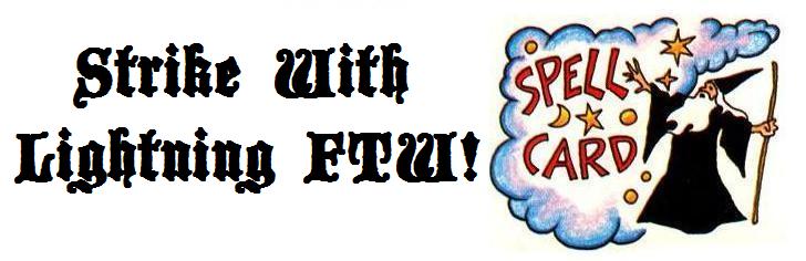
Now if there's one thing that epitomizes my love for this game, it's the wizard's spell card. The artwork on this version of the game (there were at least 3) is whimsical without being overly artsy. Every time I look at it, I think about when I first got the game, and how I so wanted to play it.

Okay, I couldn't think of anything else. But at least I won't have to create some art for the masthead!
This fascination for magic, myth, wizards, swords and sorcery all began when I was a kid (of course). My mom bought me D'Aulaires' Book of Greek Myths by Ingri and Edgar Parin D'Aulaire. The illustrations in this book are pure imagination and absolute wonder:
What probably did me in for good though was the board game Dungeon! See I was given this game for a birthday or Christmas or something...but I NEVER played it. Sadly, there wasn't anyone my age at the time (about 8) that was interested in playing. I got older, became interested in other things like music and being cool (hello ladies!) and eventually forgot about it. My mom sold it when I was in junior high school at a garage sale. It wasn't until 2 years ago that I saw one on ebay....and I fell in love all over again. And just look at the game board!
Click on the picture to see a larger version. I love the artwork, it's so colorful and fun. Every nook and cranny is crammed full of monsters of all sorts and shiny treasure. The whole board just screams of adventure! It's also damn-near primitive by today's fantasy art standards, which just makes me love it even more.
Now if there's one thing that epitomizes my love for this game, it's the wizard's spell card. The artwork on this version of the game (there were at least 3) is whimsical without being overly artsy. Every time I look at it, I think about when I first got the game, and how I so wanted to play it.
So it's fitting to christen the blog with the name...

Okay, I couldn't think of anything else. But at least I won't have to create some art for the masthead!
Subscribe to:
Posts (Atom)